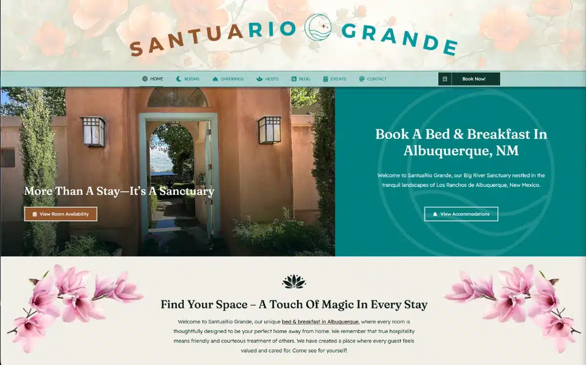
Why Mobile-First Design Matters for Albuquerque Businesses

If your website was designed for a desktop computer first and then “made to work” on mobile as an afterthought, you’re operating with one of the most common and costly disadvantages in local search. The mobile-first approach inverts that process — the phone experience is designed first, then expanded to tablet and desktop. In 2026, for any Albuquerque business that wants to compete online, mobile-first design isn’t a premium upgrade. It’s the baseline.
This is part of our complete guide to web design services in Albuquerque.
The Data Is Unambiguous
More than 60% of all web searches in the United States now happen on mobile devices. For local searches — the high-intent queries where someone is actively looking for a business like yours in a specific area — that number is even higher. Think about the actual behavior: someone drives into a neighborhood they’re not familiar with and searches “coffee shop near me.” Someone sits in their car before an appointment and searches “accountant Albuquerque reviews.” Someone lies in bed at 10pm researching options for a home renovation project. Every one of those scenarios is a phone search.
Google’s mobile-first indexing means the mobile version of your site is what Google evaluates for ranking purposes — not your desktop version. It doesn’t matter how polished your desktop site looks. If the mobile experience is slow, hard to navigate, or visually broken, Google ranks your mobile site accordingly — and your desktop traffic suffers too.
What Mobile-First Design Actually Means in Practice
Mobile-first design isn’t just making your site “responsive” — technically scaling down a desktop layout to fit a smaller screen. It’s designing the mobile experience with intentionality from the first decision, then scaling up. Here’s what that looks like in practice:
Layout and Navigation
On mobile, content stacks vertically. Navigation becomes a hamburger menu or a fixed bottom bar. Buttons are large enough to tap accurately with a thumb — not so small that users accidentally hit the wrong element. The most important content and the primary call to action are visible above the fold without scrolling, because many mobile visitors never scroll.
Typography
Mobile text is larger than desktop text — typically 16-18px minimum for body copy — because reading on a small screen requires more breathing room. Line height is generous. Contrast is high. Short paragraphs are easier to read on mobile than long blocks of dense text. Mobile-first writing is scannable writing.
Images and Media
Images served to mobile devices should be sized for those screens — not the same massive files served to desktop monitors. Modern websites use responsive images that serve appropriately sized files based on the device. WebP format, lazy loading for below-the-fold images, and compression without quality loss are all standard practices in mobile-first builds that directly impact page speed.
Speed on Cellular Connections
Mobile users are frequently on LTE or 5G connections, which can be slower and less consistent than home broadband. Every kilobyte of unnecessary code, every uncompressed image, every render-blocking script is a tax on the mobile experience that desktop users barely notice but mobile users feel immediately. Mobile-first sites are lean by design — they load fast even on imperfect connections.
Forms and Conversion Paths
Contact forms on mobile need large input fields with clear labels, appropriate keyboard types for phone numbers and email addresses, and minimal required fields. Phone numbers need to be tappable — a single tap should initiate a call. The path from “I’m interested” to “I’ve contacted them” should take as few taps as possible. Every extra step is friction, and friction costs conversions.
What a Bad Mobile Experience Actually Costs You
Let’s be specific. If a potential customer in Albuquerque finds your site through a Google search on their phone, and the site loads slowly, the text is too small to read without pinching, the contact button is impossible to tap, or the layout is broken — they’re gone within ten seconds. They hit the back button and call your competitor whose site worked. You never knew the visit happened. You never had a chance to convert them.
If this happens ten times a day — a conservative estimate for an established local business — that’s 3,650 lost opportunities per year. Even if only 5% of those would have converted, that’s 182 missed customers annually from mobile alone. The cost of a mobile-optimized website is a fraction of what those missed customers represent in revenue.
How We Build Mobile-First at Design It Right
Every site we build starts with the mobile layout. We define the phone experience first — how content flows, where CTAs live, how navigation works on a small screen, how images load efficiently on cellular — and then scale up to tablet and desktop. The result is a site that feels native and intentional on every device, not like a desktop site that grudgingly shrinks.
We also test every build on real devices — not just browser simulators — because the experience on an actual phone reveals issues that desktop testing misses entirely.
Combined with our SEO services work, a mobile-first site doesn’t just serve your visitors better — it ranks better. Read What Makes a Great Small Business Website in New Mexico for the full picture of what a high-performing small business website looks like — and start a conversation with us when you’re ready to talk about yours.


